From handprints on walls at Lascaux Caves to our modern era of the Munsell Color System and Benjamin Moore, paint is a common denominator over the course of history as a means of decorating dwelling places, temples, palaces, cathedrals, etc.
The first men used mineral-based paints, charcoal, and ochres. The Egyptians advanced the process by mixing egg, resin, or beeswax to the pigment in order to create a binder that would better adhere to the substrate. Minoans discovered the beauty of fresco, and the Greeks notably began the use of lead-based paint, a practice which lasted until the 1970s. During the Middle Ages, the ultramarine became the prized color of the upper class in interior decoration and clothing alike.
The more scarce or difficult the production of a certain color, the more expensive and valuable it became. Paints were typically oil or egg-based and mixed by hand until premixed paint cakes came into practice in the 1800s.
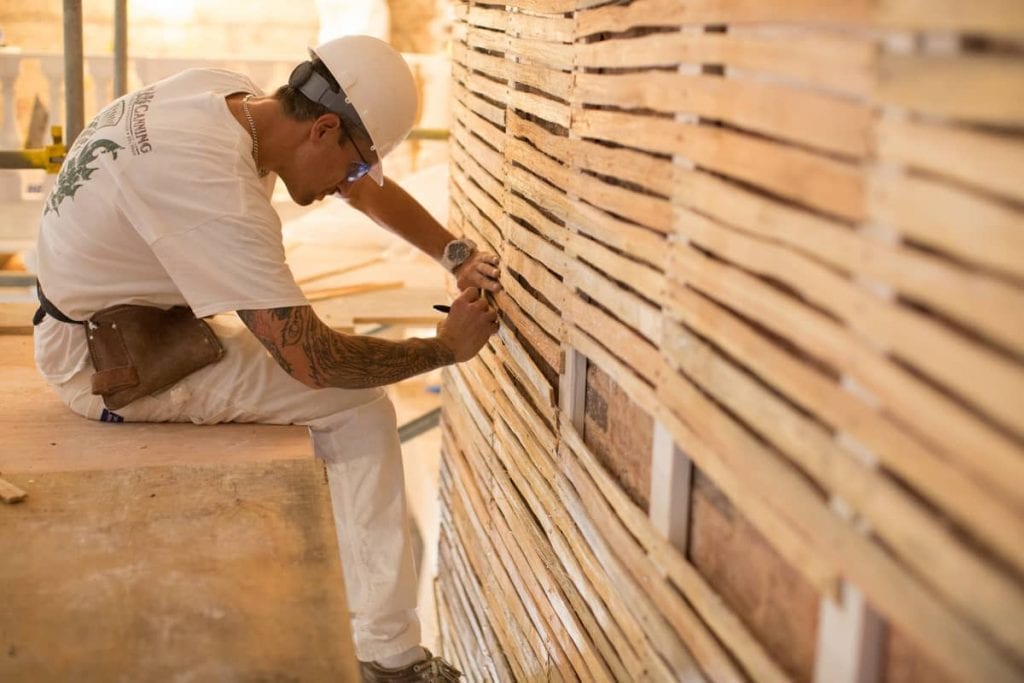
Paint technology remained largely untouched until the industrial revolution. In 1867, Sherwin-Williams’s premixed wall paints hit the shelves and changed interior design forever by giving the everyday person, not just the craftsman, the ability to easily apply paint.
Originally, the number of available paint colors was limited to the pigments sourced from nature. Pigments remained limited until the development of synthetic pigments in the 1940s, which allowed for a color palette spanning the rainbow. These advancements were largely reflected in the bright retro color palettes of the 1950s.
Below, we explore some of the popular paint colors that were commonly used in designing/decorating a number of historical periods and styles. This information can be helpful when trying to identify original historical paint and materials, or when recreating historic details and designs.
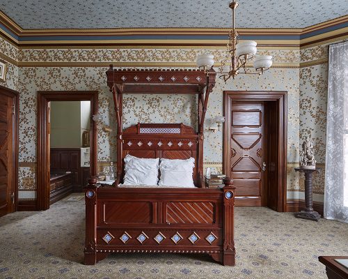
1. Colonial / American Style
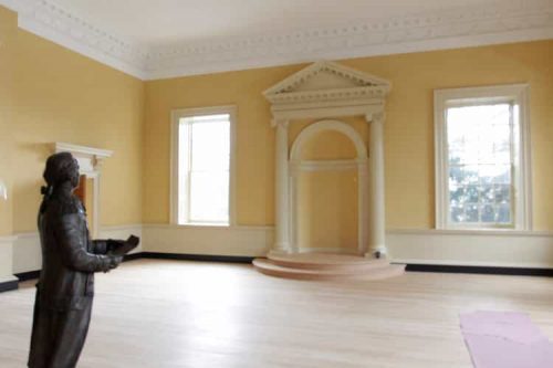
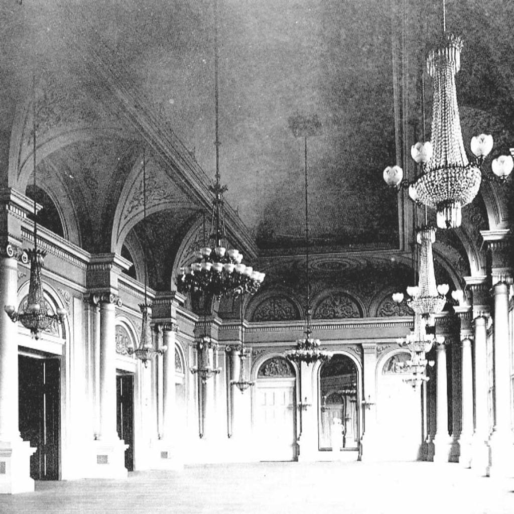
Maryland Old Senate Chamber Restoration
Historical color palettes varied based on a number of factors. Chief among these were the specific pigments used, and the process and binders used during the mixing process.
In the colonial style, we are familiar with colors sourced from ochre, umber, and sienna. In different quantities and ratios, these can become brown, burnt orange, tawny red and pink, rich tan, and yellow. From copper, blue and green shades are mixed.
The Colonial Style generally refers to the architecture and designs of the English settlers in New England, but also identifies the styles of the early Spanish settlers in California and throughout South Western America.
Colonial design very much represents the America of the time: Honest and simple living, with good proportions and elegant design. During the Colonial Revival in the 1930s, it was the ideals of steadfastness, sturdiness, and sincerity that persevered during the Great Depression, encouraging a return to colonial building styles and designs.
The Maryland Old Senate Chamber is an example of an interior that represents this style and the type of color palette that was common. To recreate the yellow hue used on these walls, we soaked dry pigments of raw sienna and yellow ochre.
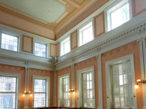
2. Georgian/Federal
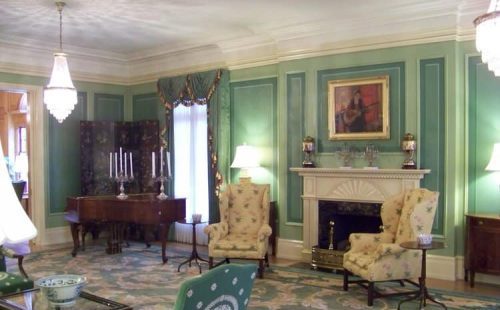
West Virginia Governor’s Residence
Following the American War for Independence, vibrant colors distinguished the walls of the Georgian/Federal era in the United States. New colors—such as green, lilac, yellow and shades of blue—found their way into patterns on wallpaper, fabric, and porcelain plates, all by way of new pigments. The patterns varied from damasks to naturalistic flowers.
These elegantly painted structures proved a stark contrast to the buildings of Colonial America. Georgian (named for the English King) and Federal (for the new order of government in America), these opposing philosophies developed into building styles. Though an interesting phenomena, it is not surprising that interested parties would build and paint in a certain manner in order to represent certain ideals. These two styles borrowed from each other and from their parents, the English Isles.
The West Virginia Governor’s Residence is a representation of the Georgian Style; with bold colors and patterns throughout the room. The color and designs of this period took on a whimsical, almost fanciful style, due to the availability of wild patterned wallpaper and paint colors.
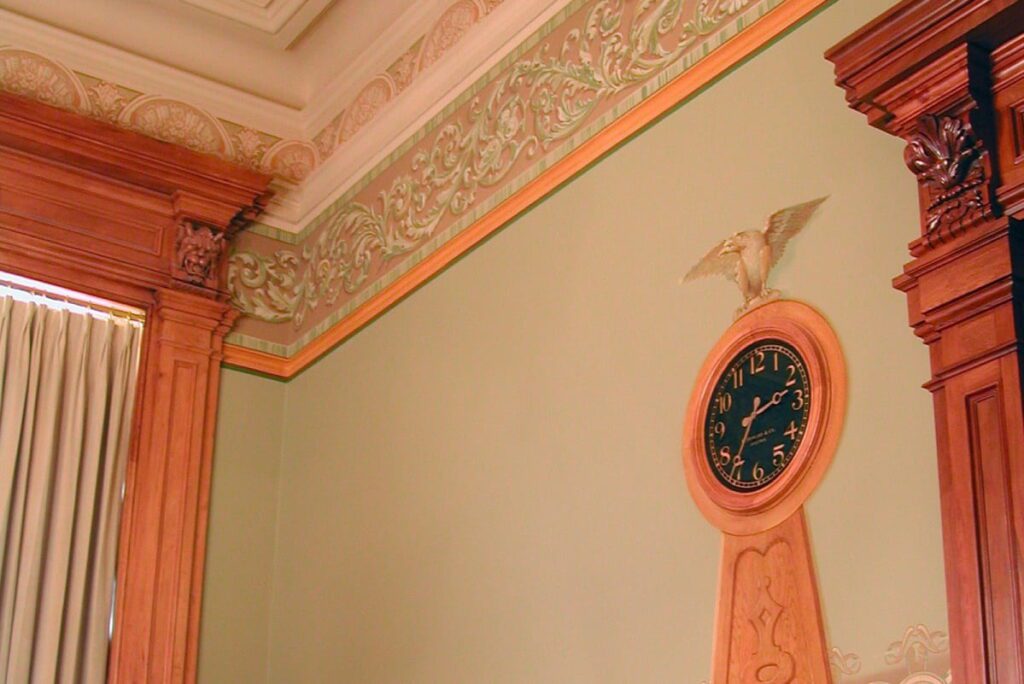
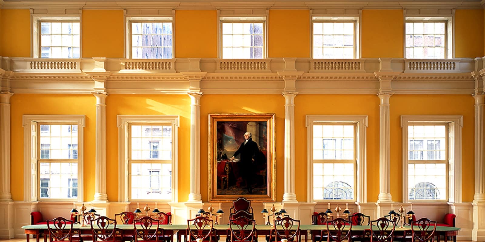
Connecticut Old State House
The Connecticut Old State House (above) is an excellent example of the Federal Style and colors common to it. Very much reminiscent of the colonial period colors and design however, much stronger and bolder.
3. NeoClassical / Greek and Roman Revival
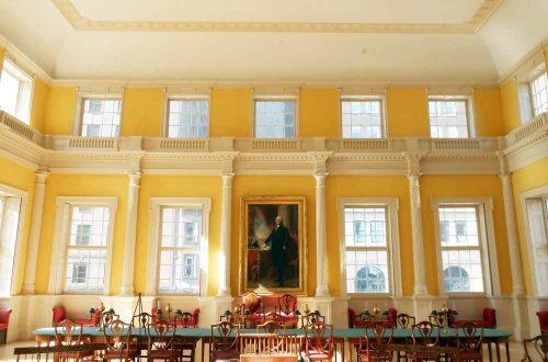
Iowa State Capitol
As archaeology distinguished Greek architecture from Roman, these styles and cultural ideals took root in young, but quickly prospering, America.
In an attempt to distinguish Democratic American from European Monarchies, the culture adopted the architecture of the Greeks and Romans as a nod to the history of Athenian Democracy and the esteemed, though short-lived, Roman Republic. These styles became known as NeoClassical, or Greek and Roman Revival.
The sun-bleached ruins of the old world inspired more subtle and modest paint schemes and colors: Cream, grey, blue, and yellow, contrasted by strong colors such as black, deep reds, gold, and silver. The colors are very much derived from the natural building elements.
The design elements found at the Iowa State Capitol Building and the Mahaiwe Performing Arts Center (top of page) reflect this aesthetic. There is a sophistication in simplicity. By utilizing the muted tones of the ancient world, the design elements in this building call to mind the philosophers and democratic government of the Greeks as well as the strength and success of the Romans.
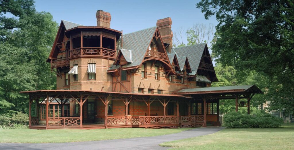
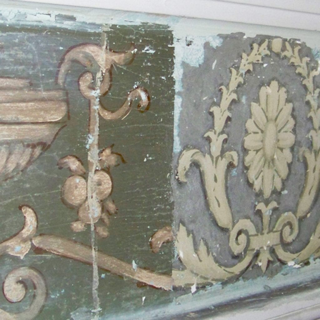
4. Gothic Revival / Victorian / Queen Anne / Aesthetic
Mark Twain House & Museum
In the 19th Century, advancements in paint mixing technology drove down the cost of paint,which allowed for an increase in decorative paint and design. Fascination with stencil design and tapestries often called for numerous colors in a single scheme. Interest in Pompeii, uncovered in the 18th century, the tombs in Egypt, prints from Imperial Japan, and medieval design added to the desire for rich colors and complex design. Taken together, these events led to the development of a number of styles, including Gothic Revival, Victorican, Queen Anne, and Aesthetic. Designer and architect Owen Jones proves an excellent example to the mode of the time. In his book, The Grammar of Ornament, Jones lists 37 principles of architecture and design, followed by pages upon pages of examples and explanations of designs from cultures all across the globe.The Mark Twain House is a perfect example of the kind of designs that came about during this time period, as illustrated by the intricately detailed wallpaper and other elements.
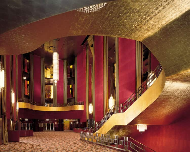
5. Art Deco / Modern
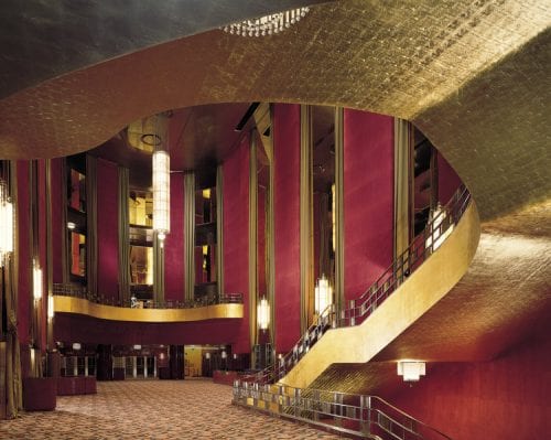
Radio City Music Hall Lobby, NYC
Strong colors and gilding dominated the post World War One era in America.
Art Deco grew out of new French designs featured in the 1925 Exposition Internationale des Arts Decoratifs et Industriels Modernes which attempted to establish a new order and interest following the wake of destruction from the war. Exotic buildings, designed to create an escape from everyday life, welcomed individuals into a temporary fantasy. Theatres were especially popular.
Machinery and the rise of modernity inspired streamline designs in American suburbia. These designs largely reflected the Bauhaus School, developing intrigue without breaking the bank.
Radio City Music Hall is a prime example of the style: glamorous with no shortage of luxury. The theatre is truly a flight from the wild New York City streets that is 6th Ave and Rockefeller Center. The dreamy lighting and shimmering gold leafed staircases ascend into another world, a world where you can be anyone and anything can happen. How fitting that such possibility should exist in the city of possibility. Now this may sound like total malarkey but this was the design intention, to create an escape from the monotony of the everyday.
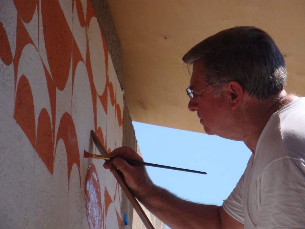
6. Mid-Century Modern
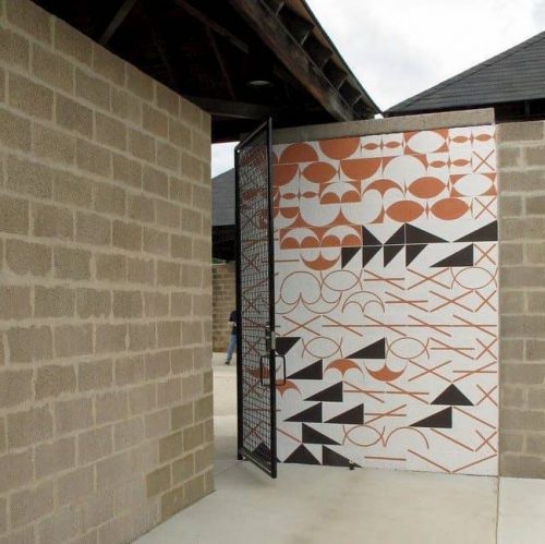
Louis Kahn Bath House
Simplified architecture followed World War Two. Perhaps due to the mass manufacturing and scale of industry, the culture began to approach all construction projects with a more efficient, “conveyer-belt” approach.
The Bauhaus School utilized glass, steel, and concrete as the final elements in design, which before may have been considered unfinished. Architecture relied on geometric shapes rather than classical proportions, causing the rise of groundbreaking new design and use of color.
The structural colors of this era were neutral-based, and often relied solely on the natural elements of the structure: Stone, wood, and glass. The use of synthetic paints, following the shortage of linseed oil during World War Two, allowed for a more varied color palette, leading to vibrant/retro colors in homes, fashion, and beyond.
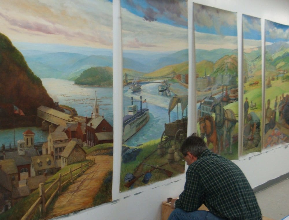
John Canning & Co. recreated the original Louis Kahn mural design utilizing historic, digitally enhanced photography. Large scale cartoons were used to re-create and execute over the original cinder block substrate.
In Conclusion
Though general, the 6 periods listed here provide an insight to the architectural designs we see all around us. The past is our resource for the future, it is a tool to create and to discover. It is important that we understand the history and significance of these stylistic periods when embarking on a restoration and when developing new design.